Neutral rooms create a calm, timeless backdrop, but they can feel flat or boring without the right pops of color. If you've ever stared at your beige sofa wondering how to inject personality, you're not alone—many homeowners struggle to choose accent furniture that energizes without overwhelming. This guide breaks it down simply.
You'll discover color theory basics tailored to neutrals, the best accent hues with real examples, and how to test them in your space. By the end, you'll confidently pick furniture that makes your room pop. It's beginner-friendly, with no design degree needed—just 20 minutes and a few household items.
Expect clear explanations, visuals (described for imagination), and tips to avoid common pitfalls like mismatched tones.
▸What You'll Need
- •Color wheel (free printable online or app like Adobe Color)
- •Photos of your current room on your phone
- •Paint swatches or fabric samples from your neutrals (optional but helpful)
- •Natural and artificial light sources in your room
Estimated Time: 20-30 minutes to read, plan, and test
Difficulty: beginner
▸Step-by-Step Instructions
Step 1: Identify Your Neutral Base
Start by pinpointing the undertones in your room's neutrals—beige, gray, white, or taupe. Warm neutrals have yellow/pink hints (like creamy beige), while cool ones lean blue/gray (like charcoal). Snap photos in natural light and compare to a color wheel.
Why it matters: Accent colors must harmonize with these undertones for true 'pop'—clashing tones muddy the effect. Expect to spot patterns, like if your walls are warm greige.
💡 Tips:
- •Use phone flashlight for even lighting when photographing.
Step 2: Understand Complementary Colors
Grab a color wheel: Neutrals pair best with complements (opposite on the wheel) or analogous shades (next to each other). For example, warm beige loves rusty oranges; cool gray shines with blues.
This is the foundation—pops happen when accents contrast saturation while sharing undertones. You'll see why pastels flop in low light but jewel tones thrive.
💡 Tips:
- •Download free apps like Coolors for digital wheels.
⚠️ Warnings:
- •Don't ignore undertones; a 'neutral' gray might be cool, killing warm accents.
Step 3: Choose Warm Accents for Warm Neutrals
For warm bases (beige, taupe): Mustard yellow, terracotta, rust orange, or burnt sienna. These earthy tones amplify coziness and 'pop' via contrast in depth.
Real-world: A mustard chair against beige walls draws the eye like a sunset. Why? Shared warmth prevents clash, creating energy.
Step 4: Pick Cool Accents for Cool Neutrals
Cool grays/whites: Navy blue, emerald green, teal, or slate. These crisp hues add sophistication and pop through vibrancy.
Example: Navy sofa against light gray feels nautical-fresh. They balance by echoing cool undertones while standing bold.
Step 5: Incorporate Neutrals' Best Friends: Jewel Tones & Blush
Universal winners: Deep jewel tones (emerald, sapphire, amethyst) and soft blush pink. They pop in any neutral by adding luxury without screaming.
Jewel tones mimic gems against stone; blush softens edges. Versatile for beginners.
💡 Tips:
- •Layer: One jewel chair + blush pillows.
Step 6: Test Accents in Your Space
Tape fabric samples or use online visualizers (like Roomstyler). View morning, noon, night—light changes everything.
Expect surprises: A color popping online might dull in dim rooms. Adjust for scale: Larger pieces need subtler shades.
⚠️ Warnings:
- •Avoid trends; test for 48 hours.
Step 7: Balance Scale and Quantity
One bold accent (chair) + 2-3 smaller (lamps, pillows) = perfect pop. Overdo it, and neutrals vanish.
Why: Neutrals recede; accents advance. Aim for 10-20% color saturation.
▸Pro Tips
- •Prioritize velvet or matte fabrics—they reflect light for extra pop.
- •Metallics (gold/brass) as accents amplify colors without fabric commitment.
- •Use odd numbers (3 pillows) for dynamic flow.
- •Shop in person; screens distort hues.
- •Layer textures: Leather accents pop more than smooth fabrics.
- •Consider room function—bedrooms love softer blush, living rooms bolder navy.
- •Refresh seasonally: Swap pillows before full furniture.
▸Common Mistakes to Avoid
- •Matching accents too closely to neutrals—creates monotony, no pop.
- •Ignoring lighting: Dark rooms need brighter accents; test thoroughly.
- •Overloading with multiple bold colors—pick a palette of 2-3.
- •Forgetting scale: Tiny accents get lost in big rooms.
- •Chasing trends over undertones—leads to quick regrets.
▸Troubleshooting
Problem: Accent looks dull/not popping
Solution: Boost lighting (add lamps) or swap for higher saturation version. Check undertone mismatch.
Problem: Colors clash after purchase
Solution: Return policy shop; use apps like Havenly for virtual staging first.
Problem: Room feels too busy
Solution: Reduce to one hero accent; neutralize with white pillows.
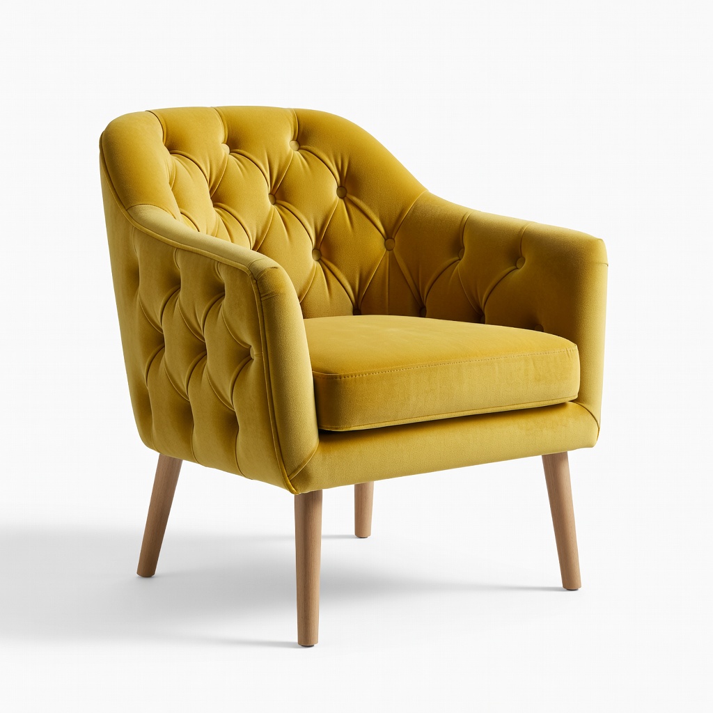
Zuri Origins Modern Tufted Velvet Accent Chair, Mustard Yellow
Mustard pops vibrantly against warm neutrals like beige, adding cozy warmth with luxe velvet texture.
Best for: Living room focal point for beginners wanting earthy energy.
Price Range: $150-$200
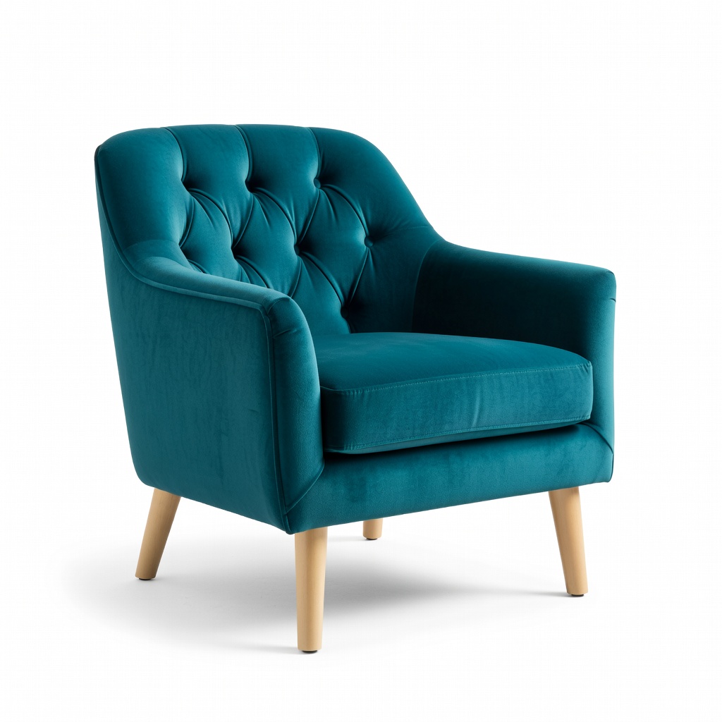
Novogratz Brittany Tufted Velvet Upholstered Accent Chair, Teal
Teal contrasts cool grays beautifully, offering jewel-tone depth without overwhelming.
Best for: Small apartments needing a cool, sophisticated pop.
Price Range: $130-$160
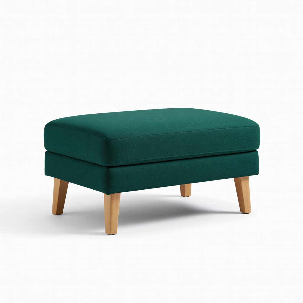
Christopher Knight Home Alizea Fabric Ottoman, Emerald Green
Compact emerald size-perfect for testing jewel tones; versatile footrest/table.
Best for: Budget entry to accents in any neutral bedroom or office.
Price Range: $50-$70
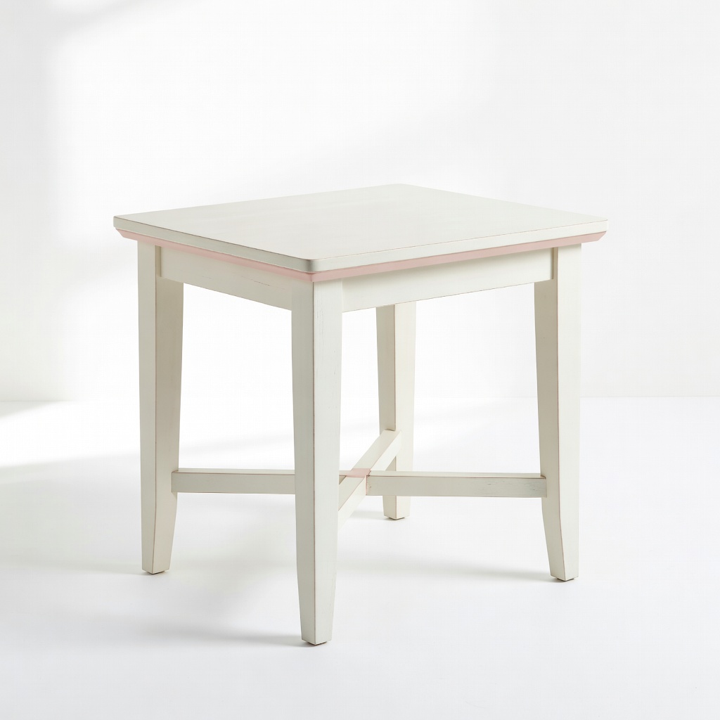
Bush Furniture Key West Side Table, Antique White with Blush Accents
Subtle blush drawer pops softly in neutrals, ideal starter piece.
Best for: End tables beside sofas for gentle color intro.
Price Range: $80-$100
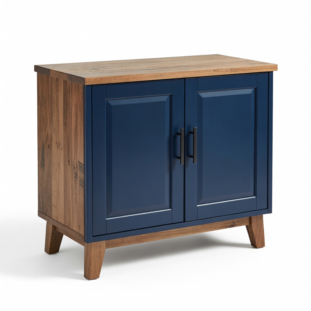
Walker Edison Modern Rustic Wood Accent Cabinet, Navy
Navy cabinet adds storage + bold pop for cool neutrals.
Best for: Entryways or living rooms needing function with style.
Price Range: $120-$150